What Are the Best Ways to Attract Attention on Shelves?
Attracting attention on shelves is one of the biggest challenges for brands today. With so many products packed closely together, it can be hard for a product to stand out. Customers often make buying decisions in just a few seconds, so the way a product looks on the shelf can greatly influence sales. Packaging design, color, shape and messaging all play key roles in grabbing attention. In this article, we explore various strategies brands can use to catch the eye of shoppers and how they can make their products memorable.
Why Is Packaging Shape Important for Shelf Visibility?
Different shapes can make a product stand out from competitors. Standard rectangular or square boxes often blend together. Unusual shapes such as tall, thin or hexagonal boxes catch the eye. Angles and proportions influence perception and curiosity. Customers pick up items that feel distinctive. Shapes must remain functional and stable on shelves. Small startups can experiment with shapes without risking usability. Creative but simple adjustments often attract attention more effectively than elaborate designs. Shape combined with color or graphic patterns boosts visibility. Brands observing shelf arrangements can choose forms that create variety while maintaining brand consistency.
How Can Typography Enhance Customer Attention?
Typography communicates product identity beyond words. Combining typography with color and space guides attention without overwhelming viewers. Even small adjustments in letter spacing or alignment can improve legibility. Typography interacts with graphics and packaging shape to enhance overall appeal. Choosing consistent typefaces strengthens brand recall. Displaying essential information prominently can influence buying decisions during short shelf interactions where customers rarely read entire text.
How Do Illustrations and Graphics Affect Shelf Presence?
Visual storytelling helps customers understand products without reading text. Illustrations of ingredients or usage show product purpose immediately. Patterns, icons and minimal imagery attract curiosity and encourage interaction. Graphics create differentiation from surrounding products. Displaying appealing visuals alongside consistent brand elements helps customers associate images with product identity. Shoppers respond emotionally to scenes, faces, or context depicted on packaging. Graphics can emphasize quality, origin or target audience without words. Combining visuals with shape, color and typography strengthens overall shelf impact. Observing popular styles in the market allows brands to create visuals that stand out while aligning with brand strategy.
What Role Does Material Play in Shelf Appeal?
Material affects perception of quality and usability. Cardboard, kraft or eco-friendly options show functionality and sustainability. Glossy finishes attract attention with reflection, while matte surfaces create subtle focus. Texture communicates value during tactile interactions. Durability protects the product and maintains appearance on shelves. Material choices also affect printing options and color reproduction. Selecting sustainable options can enhance customer perception of brand responsibility. Materials combined with packaging form influence stacking, display and handling. Thoughtful choices in material reduce product damage and improve customer satisfaction. Observing shelf handling practices helps brands select material that meets functional and visual needs simultaneously.
How Can Shelf Arrangement Improve Product Attention?
Placement on shelf determines visibility. Eye-level positions receive most attention, but grouping by color or category can create patterns that attract curiosity. Horizontal or vertical alignment guides customer movement. Complementary products placed nearby encourage cross-selling. Rotation frequency and shelf restocking impact which items receive attention. Strategic arrangement can highlight promotions or new launches. Shoppers notice symmetry or irregularity differently depending on surrounding products. Using shelf arrangement alongside packaging elements improves visibility without redesigning products. Observing competitor organisations provides insight into positioning strategies. Adjustments in shelf layout influence purchase decisions and allow brands to maximize attention from available space.
How Does Storytelling on Packaging Engage Customers?
Stories connect shoppers to brand and product purpose. Short narratives about ingredients, origin, or production create emotional engagement. Chocolates or snacks can include information about farmers or source regions, enhancing perceived authenticity. Storytelling encourages trust and memory recall. Packaging can convey values or ethical practices without long text. Visual cues combined with concise wording strengthen the narrative. Storytelling encourages repeat purchases and strengthens brand loyalty. Even simple statements can communicate product benefits or experience. Customers remember context and stories associated with products more than plain information. Combining storytelling with visual and structural packaging elements increases attention and retention.
Why Are Custom Boxes Becoming Popular?
Custom packaging differentiates products in competitive markets. Unique shapes, colors and finishes attract customer interest. Custom styles allow targeting specific audiences or types of products. Small brands benefit from creating recognizable identity on shelves. Functionality can align with aesthetics, creating practical yet noticeable packaging. Brands can adjust designs for different campaigns or product lines. Creative solutions provide ways to reflect brand values and mission. Custom styles of boxes help businesses communicate identity without relying solely on text or logos.
How Can Innovative Packaging Boost Brand Recall?
Packaging that includes unique features improves memory of the brand. Pull-tabs, windows, foldable sections or interactive surfaces encourage exploration. Novel elements prompt conversation and social sharing. Innovation can be simple, such as a different opening mechanism or interior design. Products with creative design often attract repeat buyers. Visual recognition strengthens brand recall over time. Innovation combined with clarity ensures customers understand function without confusion. Subtle surprises maintain interest and encourage comparison with competitors. Observing market trends allows brands to experiment safely. Strategic innovation reinforces identity, enhances engagement and increases likelihood of selection.
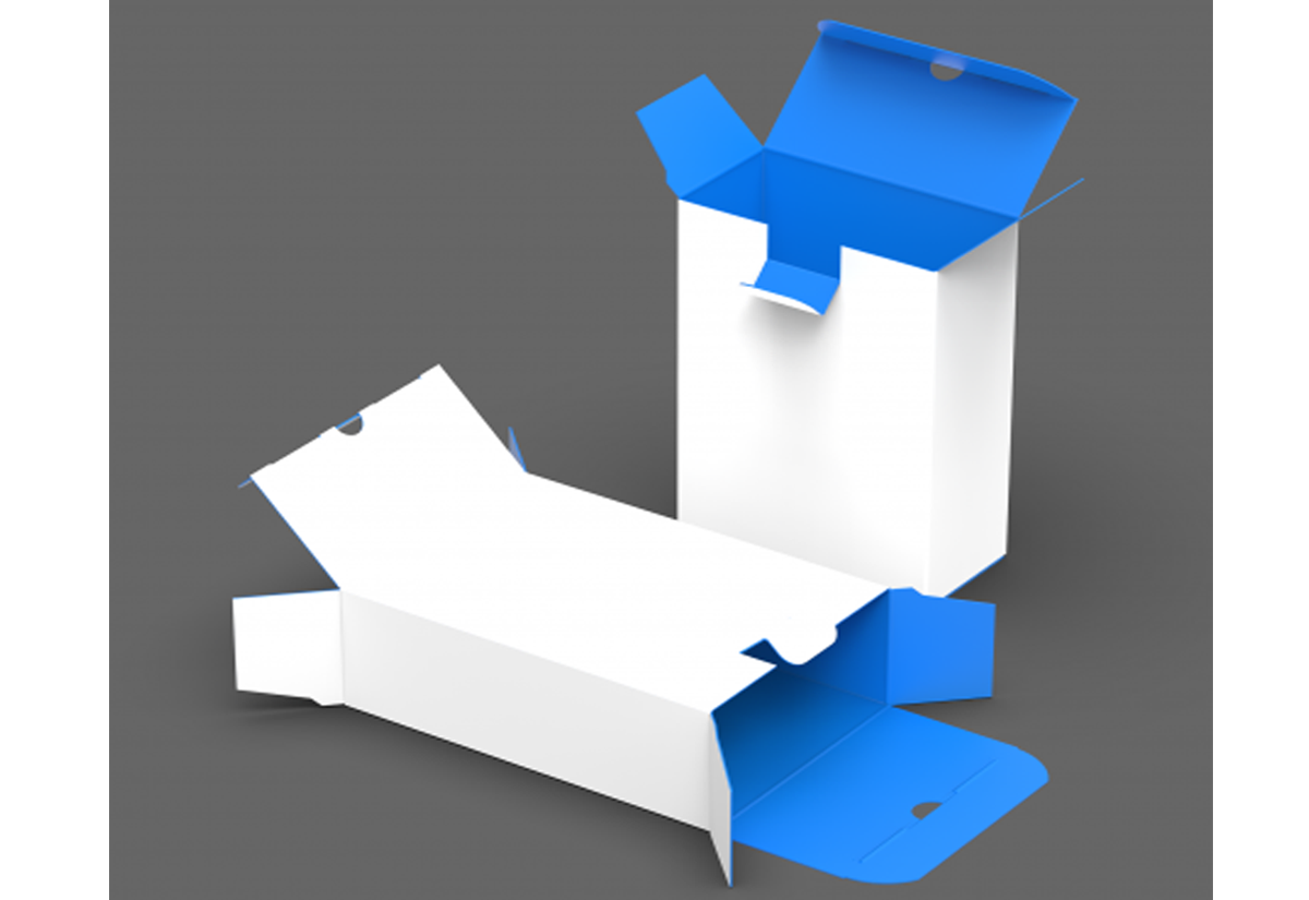
How Can Custom Packaging Improve Product Presentation?
Custom packaging allows easy opening and secure closure while maintaining organized display. Boxes stack efficiently, showing front design clearly. This packaging style suits multiple products from cosmetics to snacks. Simple surfaces can accommodate graphics and branding without clutter. Businesses and startups gain flexibility in design, printing, and presentation. UPacked provides solutions for creating Reverse Tuck Packaging with professional finishing. Customers can handle products without damage. Stacking and shipping remain efficient. This style allows integration of promotional messages, logos, or patterns naturally. Functional design combined with visual clarity increases shelf appeal and enhances customer experience.
How Can Shelf-Friendly Packaging Increase Sales?
Shelf-friendly packaging considers durability, presentation and handling. Sturdy boxes prevent damage, while shape supports upright display. Clear designs attract attention and allow quick recognition. Space-efficient designs improve retailer organization and product rotation. Shelf-friendly packaging reduces returns and waste. Well-structured boxes encourage comparison and selection. Packaging that fits naturally on shelves communicates professionalism and practicality. Combining visual clarity, material choice and functional design improves sales potential. Observation of retailer practices helps brands develop packaging that works in real-world conditions. Thoughtful packaging simplifies handling, supports display, and drives customer selection.
How Can Brands Choose the Right Packaging Partner?
Selecting the right partner ensures alignment of design, functionality and brand identity. Experienced partners provide guidance from concept to production. Companies like UPacked specialize in custom boxes, creating solutions for businesses and startups. Expertise in material, printing, and assembly guarantees consistent quality. Collaborating with professionals avoids errors and reduces waste. Communication throughout production ensures expectations match results.
Related Post

Metro Cab Detroit With Detroit Metro Airport Sedaw
Getting around Detroit should be simple and stress-free. Whether you are arriving at the airport…